SPOTLIGHT DANCE ACADEMY

SPOTLIGHT DANCE ACADEMY
2017
Personal Project
Brand Design
The Spotlight Dance Academy is a little dance studio that I pass every day when I drive to school or work, and it’s where my childhood friends would go for their lessons when we were ten years old. Since then, their design has remained pretty rooted in their small-town beginnings, and I was drawn to rebrand their identity.

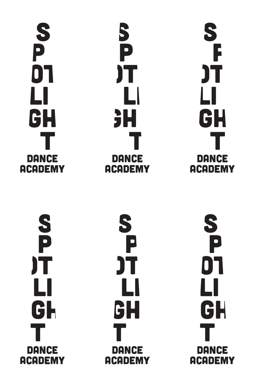
The academy focuses on individual growth, as most of their students are younger beginners, and those who want to dance just for fun. This idea is illustrated with the spotlight itself, a light that illuminates a specific place or person, especially performers. Using this as the inspiration, the logo illuminates the letters in “spotlight” and hides the edges where they disappear out of the light. The animated logo showcases movement through dance, as the letters jump on their own path.
I’ve also introduced colorful squiggles which represent dancers, livelihood, moves, and direction. They were turned into a pattern which is applied to the business cards, and the back of the letterhead.


